
Introducing the new Dashboard
We shipped the biggest visual update to Pocketfuzz since launch last month. If you've opened the app recently you'll have noticed it immediately — the home screen looks and feels completely different. Here's the story behind that change.
Why we rebuilt it from scratch
The original dashboard was designed when Pocketfuzz had three features. Today it has considerably more, and that history showed. We had bolted new sections onto old foundations until the screen felt cluttered, slow, and frankly a bit embarrassing.
Rather than patch it again, we made the decision to start from a blank canvas. We ran a short internal design sprint — three days, lots of sticky notes — and came out with a clear set of principles for the new version:
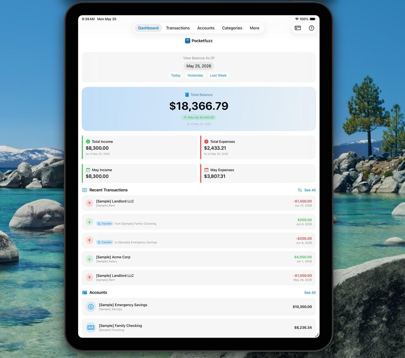
- One number above the fold. Your current balance is the first thing you see, large and unambiguous. Everything else is secondary.
- Recent activity without friction. The last five transactions are visible immediately, with no tap required.
- Upcoming obligations front and centre. Recurring bills due in the next seven days sit just below recent activity so you're never caught off guard.
What changed technically
The old dashboard rendered every section as a separate fetch. On a slow connection this produced a noticeable staggered load — numbers popping in one by one. The new version fetches everything in a single batch on launch and renders in one pass. The difference on older devices is significant.
We also dropped the custom graph library we'd been using and rewrote the spending sparkline in native code. It's faster, uses less memory, and we can now control exactly how it looks without fighting someone else's API.
What's coming next
The redesign opened up space for features we couldn't fit before. On the roadmap for the next two releases:
- Customisable dashboard widgets — reorder and hide sections to match how you think about your finances.
- A monthly snapshot card that appears on the first of each month showing last month's totals.
- Colour-coded balance: green when you're ahead of your monthly target, amber when you're close, red when you've overrun.
As always, the best way to influence what we build next is to get in touch. We read every message.